Social sharing has always played an important role in helping blog content reach new audiences. While search engines remain a major source of traffic, many readers still discover articles through recommendations, shares, and discussions across social platforms.
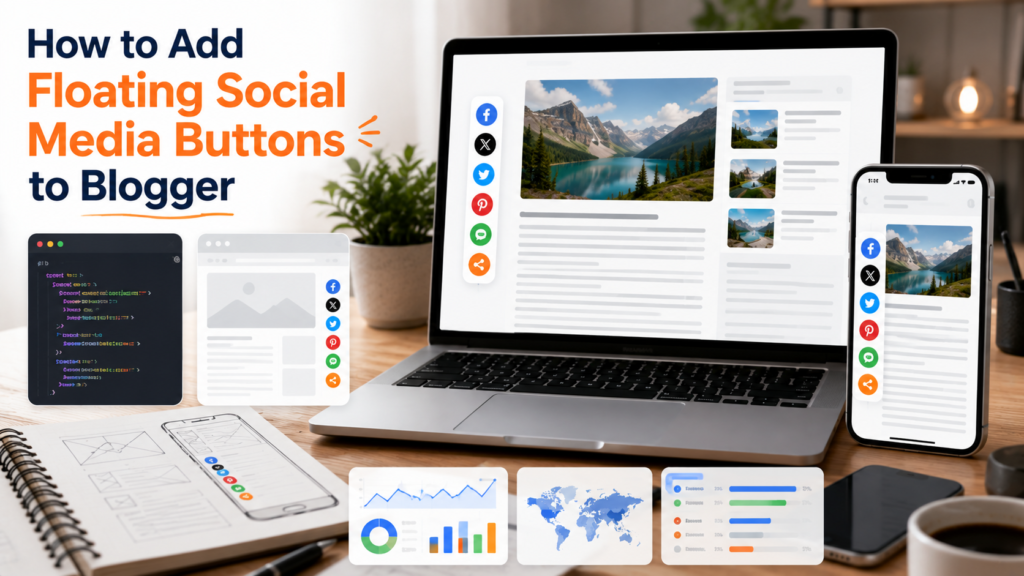
One of the most common ways to encourage sharing is by using floating social media buttons. Unlike traditional share buttons placed at the top or bottom of a page, floating buttons remain visible as visitors scroll through content.
When implemented thoughtfully, they can improve content distribution and make sharing more convenient. However, poorly designed floating buttons can also create usability issues, slow down pages, and interfere with the reading experience.
This guide explains when floating social media buttons make sense, how to implement them effectively, and how to avoid common mistakes that can negatively impact user experience.
What Are Floating Social Media Buttons?
Floating social media buttons are sharing controls that remain visible while a visitor scrolls through a page.
Instead of disappearing once readers move beyond the top of an article, the buttons stay attached to the side, bottom, or corner of the screen.
Typical actions include:
- Sharing an article
- Copying a link
- Sending content to social platforms
- Saving content for later
- Recommending articles to others
The goal is to make sharing accessible without requiring readers to scroll back to the beginning or end of a post.
Why Bloggers Use Floating Share Buttons
Content creators often invest significant effort into producing useful articles. Sharing tools help readers distribute that content more easily.
Floating buttons can provide several benefits:
- Increased visibility of sharing options
- Improved convenience for readers
- Better support for content distribution
- Greater exposure for evergreen content
- Reduced friction during sharing
When implemented correctly, floating buttons can complement other social sharing widgets without overwhelming readers.
When Should You Use Floating Social Buttons?
Floating buttons work best when:
- Articles are long-form content
- Readers spend significant time scrolling
- Social sharing is part of your publishing strategy
- Mobile usability has been carefully considered
- Performance remains acceptable
They may be less useful for:
- Short announcements
- Minimalist websites
- Mobile-first layouts with limited screen space
- Blogs that already have multiple sharing systems
The decision should be based on user experience rather than simply adding more features.
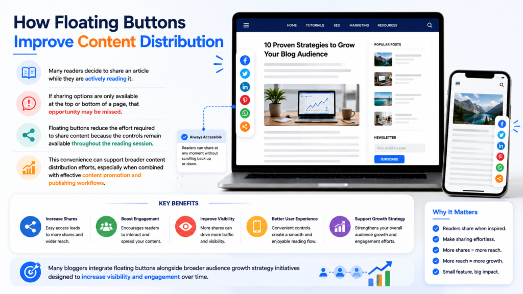
How Floating Buttons Improve Content Distribution
Many readers decide to share an article while they are actively reading it.
If sharing options are only available at the top or bottom of a page, that opportunity may be missed.
Floating buttons reduce the effort required to share content because the controls remain available throughout the reading session.
This convenience can support broader content distribution efforts, especially when combined with effective content promotion and publishing workflows.
Many bloggers integrate floating buttons alongside broader audience growth strategy initiatives designed to increase visibility and engagement over time.
Setup Considerations Before Installation
Before adding any floating sharing system, review the following factors.
Screen Space
Floating elements occupy valuable interface space.
Ensure the widget does not interfere with reading.
Mobile Experience
Small screens require special attention.
A design that works perfectly on desktop may become intrusive on mobile devices.
Visual Hierarchy
Sharing buttons should support content rather than dominate it.
Performance Impact
Some sharing tools load numerous external scripts.
Excessive scripts can slow page performance and negatively affect user experience.
Choosing the Right Position
Floating buttons can appear in several locations.
Left Sidebar
A common desktop placement that remains visible while scrolling.
Right Sidebar
Useful when the site layout already includes right-aligned navigation elements.
Bottom Corner
Popular for mobile-friendly implementations.
Sticky Bottom Bar
Often used on mobile devices where vertical space is limited.
The ideal location depends on the overall layout and reading experience.
Mobile Warnings
Mobile usability is one of the most important considerations when implementing floating share buttons.
Common problems include:
Obstructed Content
Buttons that overlap text can frustrate users.
Small Touch Targets
Buttons should be easy to tap without accidental clicks.
Excessive Screen Occupancy
Sharing controls should never dominate the viewing area.
Conflicts With Navigation
Floating elements should not interfere with menus or essential interface components.
As mobile-first design continues evolving, balancing visibility and usability will become increasingly important.
Performance Tips
Fast websites provide better experiences.
When evaluating floating social widgets, consider the following best practices.
Minimize Third-Party Scripts
Use only the sharing features you actually need.
Avoid Multiple Sharing Plugins
Running several overlapping systems can increase page weight unnecessarily.
Test Page Speed
Measure performance before and after installation.
Monitor User Behavior
Pay attention to whether the buttons actually improve engagement.
Effective blog engagement tools should enhance the reader experience rather than create distractions.
Common Mistakes
Too Many Social Platforms
Displaying every available platform can overwhelm users.
Focus on the most relevant sharing options.
Aggressive Positioning
Buttons should remain accessible without becoming intrusive.
Ignoring Mobile Visitors
Always test across multiple devices.
Prioritizing Visibility Over Usability
The most visible solution is not always the most effective.
Neglecting Performance
Every additional script has a potential impact on page speed.
Balancing Sharing and User Experience
The best floating sharing systems strike a balance between convenience and simplicity.
Readers should notice sharing options when needed, but those options should never distract from the content itself.
For many Blogger users, a lightweight floating share bar can be a useful addition when combined with other social sharing widgets, effective blog engagement tools, and a broader audience growth strategy focused on sustainable content discovery.
Frequently Asked Questions
Do floating social buttons increase shares?
They can increase visibility and convenience, which may encourage more sharing activity.
Are floating buttons good for mobile users?
They can be, provided the implementation is responsive and does not interfere with content.
Do floating widgets affect page speed?
Some implementations can affect performance, especially if they rely heavily on external scripts.
Where should floating buttons be placed?
Common locations include sidebars, sticky corners, and mobile bottom bars.
Should every blog use floating social buttons?
Not necessarily. The decision should depend on audience behavior, layout design, and overall user experience goals.
Final Thoughts
Floating social media buttons remain a useful tool for Blogger users who want to make content sharing more accessible.
The key is moderation. Sharing tools should help readers distribute content without interrupting the reading experience. By prioritizing usability, performance, and mobile responsiveness, bloggers can implement floating sharing features that support both engagement and content distribution goals.
As publishing continues evolving across devices and platforms, successful sharing experiences will increasingly depend on finding the right balance between visibility, speed, and user satisfaction.